My Travel Health App
A Global Travel Health Expert
in Your Pocket
01: Overview - Background
Two health experts in SE Minnesota approached us with an idea. What if their bulky travel health information was transformed into a simple app?
This could enable hundreds of pages of information to be personalized by a traveler in just a few seconds. Plus, our client's content updates could be distributed immediately over-the-air instead of needing to print a new guidebook. With these goals in mind, we began.


02:
Process -
Planning
Core Features
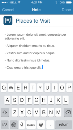
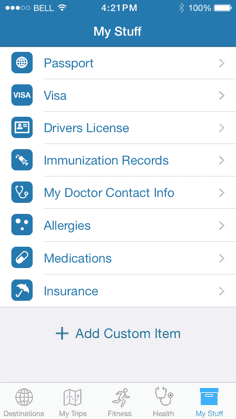
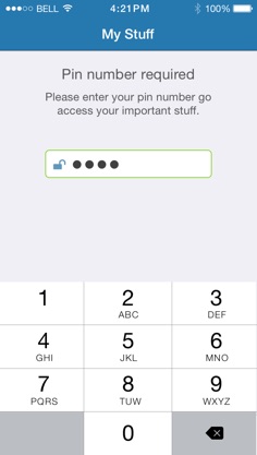
First, we helped the client narrow the list potential features based on their long-term strategy. Asking questions helped us uncover the client’s core needs and plan out solutions to achieve stunning results. Our design, marketing, and engineering team worked collaboratively to establish a well-rounded roadmap.
03:
Solution -
Prototype
Design
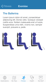
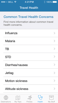
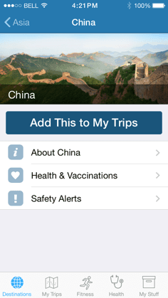
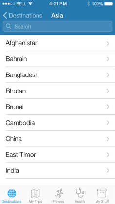
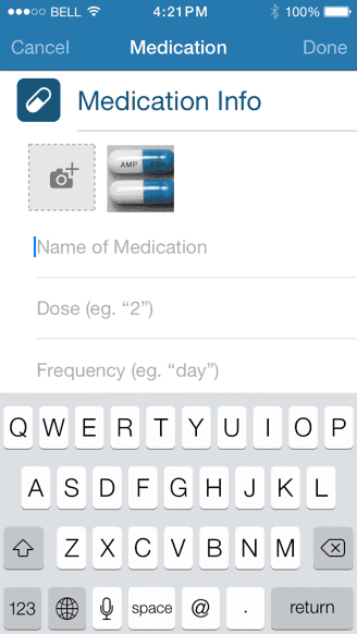
This is where rubber meets the road. We brainstormed potential layouts and tested our ideas with a realistic mobile prototype, loaded onto an iPhone. By starting rough and blocky, we gave priority to the foundational user experience flows and content elements. After many iterations and improvements, we were ready to create high-fidelity mockups. We layered colors and custom icons to create a pixel-perfect plan, including retina images for dense Apple screens.
04:
Solution -
Code &
Platforms
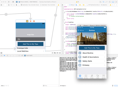
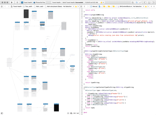
Based on user needs and client goals, we weighed the benefits of hybrid vs. native programming. Our focus was soon narrowed to native iOS, selecting Objective-C and Swift for an optimal user experience. Next, we selected a blend of modern elements such as Laravel (a PHP framework) for the web application and administrative panel.
05:
Solution -
Easy & Fast
Content Updates
We created a unique content management system (CMS) to let the client push updates on their own schedule. When fresh content becomes available, users are notified when they open the app and can easily update with one button tap.
Content updates are fed from a customized web-based dashboard and cloud server to avoid republishing through the Apple App Store every time a content update was made. We also invented a way to allow most content areas to work truly anywhere such as tunnels and remote countries, without an internet connection.
Additionally, if a user’s device were to lose internet connectivity during a content update, the data could become corrupt. We overcame this challenge with a custom application programming interface (API) method that allowed our server and apps to communicate reliably.
After ironing out a few initial kinks during testing, the system has performed flawlessly.
06:
Solution -
App Store
Setup
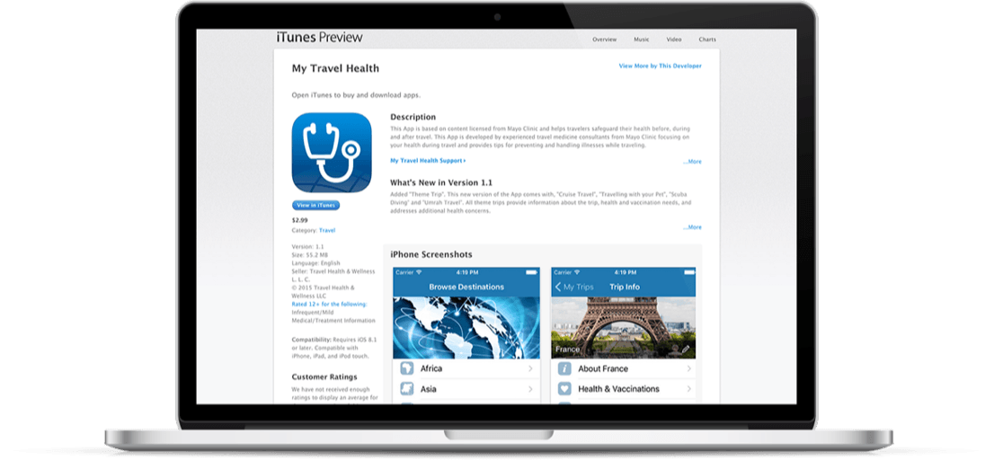
We guided the client through the setup process for their own Apple Developer account, which allowed us to publish the app under their name rather than ours. We then provided high-resolution screenshots and key word recommendations to optimize their App Store listing. This was essential to standing out in an increasingly competitive app market.
07:
Impact -
Results &
Reliability
There’s nothing like the feeling of pouring hundreds of hours of ideas and effort into an app and then downloading it for the first time. Especially when we can help users make smarter health decisions in the process.
Many months after launch, the app still has scored zero crash reports according to Apple. In this case, zero is the perfect score. After so many painstaking hours of custom iOS development and testing, we are very pleased to achieve such a high standard of reliability.
