Hayfield Window & Door
Leading an Industry
01: Dream Big - Background
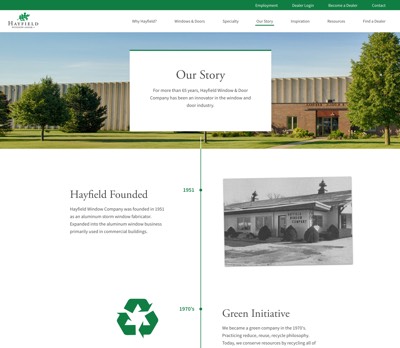
Hayfield Window & Door Co. asked us to help come up with a plan to give their business a world-class website to align with their strong growth and customizable products.
Their old website was failing to convey the quality and variety of custom products Hayfield has been building for more than 65 years. Their old website was also missing a brand new product line launched with their pioneering technology of stainable vinyl wood grain windows.
It became clear that our goal would be to create an excellent mobile-friendly sales tool for dealers, along with an easy-to-use interface for home owners looking to do their own research. Our technical tools of choice would be Laravel and Vue.js. With key objectives in hand, our partnership began.


02:
Dream Big -
Understanding
The Customer
Together with the Hayfield team, we dove head first into the needs and goals of their customers. We established a survey to gather feedback from dealers. We used this dealer feedback along with Google Analytics data, competitive research, and our own project team's expertise to outline a business savvy plan for success.
We also dug deep into Hayfield's product lines, custom options, and industry jargon to help ensure the entire project team was well educated and unified.
03:
Plan Smart -
Content Audit
and Wireframing
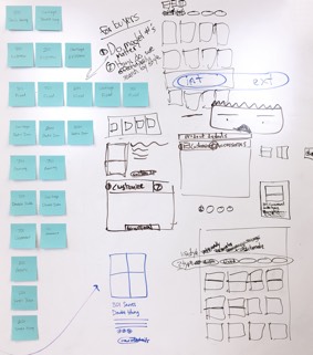
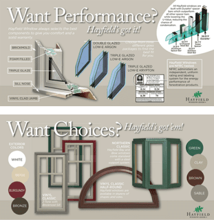
We love working with clients to solve hard challenges and revitalize an aging brand. But if you've ever worked on a website redesign or large-scale rebranding effort, you know how much work it can be.
Having exciting goals on the horizon and being confident we can get there together helps us overcome any obstacles, no matter what it takes.
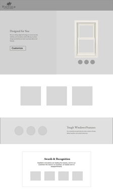
We worked with the Hayfield team to gather their print marketing materials, specification documents, photos, and more. The Hayfield team even unearthed up some important information that had previously only lived in the minds of their engineering and design team. We asked a lot of questions, listened, and helped refine our game plan through our content audit and wireframe processes.
04:
Plan Smart -
Fresh
Photography
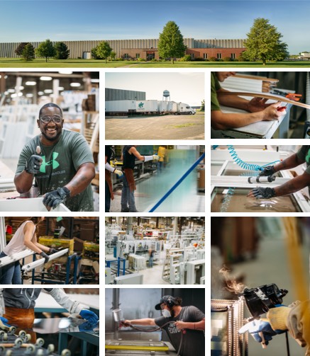
One of the exciting ideas we came up with was to show the care and craftsmanship of the Hayfield way by capturing high-quality photos of their production team in action. We planned and completed a strategic photo shoot at Hayfield's facilities, resulting in some great pictures that have been used throughout the new website and beyond.
05:
Plan Smart -
Design
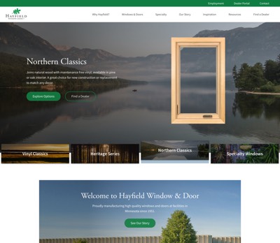
How can a modern manufacturer stand out and win against Goliath-sized competitors? By being very strategic with design, branding, and user experience.
Our biggest ah-ha moment came when we spent time thinking about why someone buys windows at all. In essence, windows are a way of bringing the outdoors in. A viewport into the world beyond.
So we came up with a visual theme to go with each product series. This new brand principle became a driving source of design inspiration throughout the rest of the website.

06:
Do Well -
Inspiring
Buyers
To help inspire customers about the possibilities of their own home, we created a gallery of existing customers' homes with Hayfield windows and doors. You can also see a direct link to the relevant product page(s) to explore configuration options further. We even built an admin panel so the Hayfield team can update the inspiration gallery and product links easily.
07:
Plan Smart -
Finding the
Perfect Window
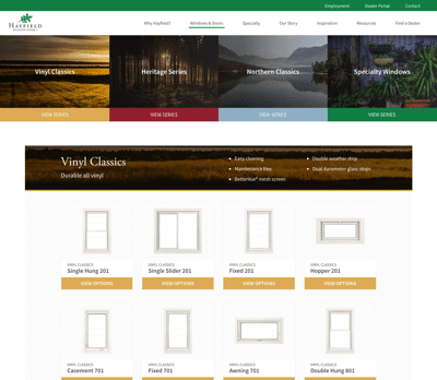
We encountered a common dilemma. How much information feels overwhelming, and how much information is too little? We had to discover the right balance based on context and customer needs.
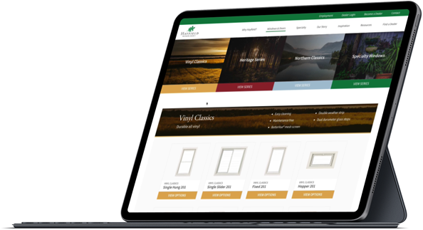
Throughout the website, we worked hard to only show as much detail as the user needs in the moment. This helps the website feel fresh and clean. For example, on the Windows & Doors page, we came up with a concept to provide little educational bits of text about window types as the user hovers or taps on a product.
08:
Do Well -
Exploring
Options
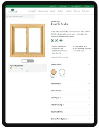
This was the hardest part of the design to solve. We aren't satisfied until the user experience (UX) feels easy-to-use and pleasant on all screen sizes, from desktop down to mobile.
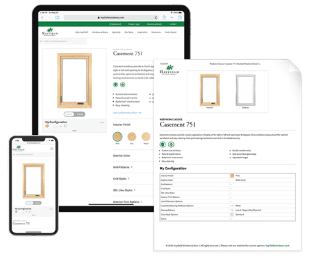
After several concepts and some testing, we came up with a split screen view that let's a potential customer explore options and features on the right, while seeing a live preview on the left. We also integrated an easy print button that creates a custom printable configuration sheet, that can be taken or emailed directly to a dealer for ordering. It all works great on mobile too!
09:
Do Well -
Mobile, Desktop,
and Print
In today's modern era, it's essential that we cater to every screen size. Print design is often overlooked. For Hayfield, we created a custom print style for the product customization pages, so a customer can select their own options and then print a good-looking PDF to show others or take straight to their local dealer.
10:
Do Well -
Find a
Dealer Map
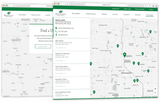
We created an easy-to-use map so customers can quickly find their nearest dealer. Just enter a zip code and click one button. On the admin side, the Hayfield team has a simple yet robust way to manage dealer listings and contact information.

11:
Do Well -
Dealer
Login
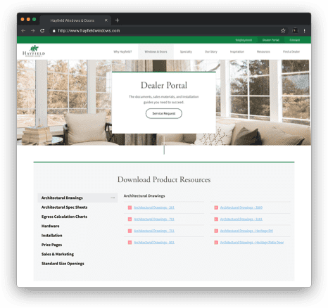
Through a custom admin portal, we gave Hayfield the capability to invite dealers to access password protected spec sheets, pricing guides, drawings, and more. The Hayfield team is easily able to manage this system from the back-end with their own secure login.
12:
Do Well -
Rebuilding a
Sister Brand
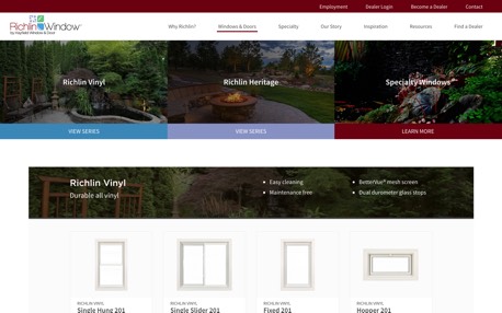
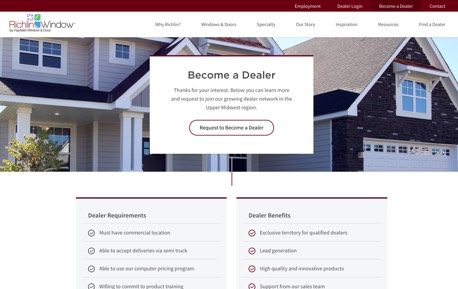
After a successful launch of the new hayfieldwindows.com, the Hayfield team also wanted to create a new website for their other brand, Richlin Windows by Hayfield. Richlin caters to a more upscale clientele, many of whom are looking to remodel their existing home. We used similar pieces as Hayfield, but added several new twists such as video backgrounds on the homepage. We loved working on this website too and coming up with a fresh brand presentation.
13:
Impact -
Thoughts
from the Team
BrandHoot took the time to get familiar with our products and took care to make sure we were all heading in the direction of the final goal through each step. We are now able to provide much more information to our customers and the end user as well, all on one website. BrandHoot pays extremely close attention to every detail.
Hayfield Window & Door Team
The truth is that we encountered some big challenges with this project, but the team stayed focused and worked hard. We were able to overcome the challenges and make some really complex ideas appear very simple to the user. We leveraged Laravel and Vue.js on the technical side. Hayfield's new website is above every major competitor in their industry in terms of website speed and features. We enjoyed working with the Hayfield team, and are excited to continue supporting their mission for years to come.
BrandHoot Team